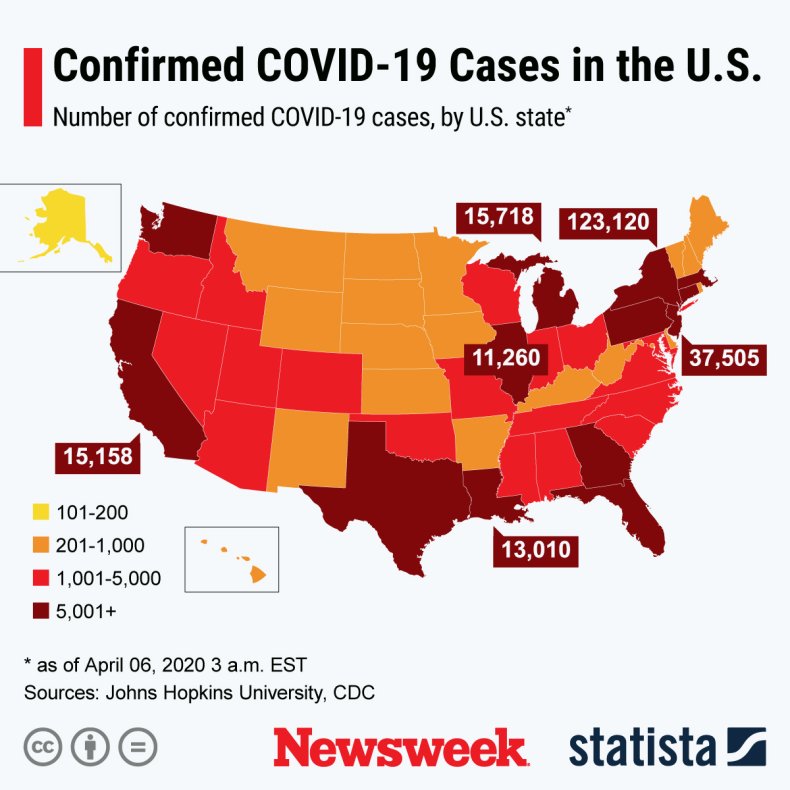
There is some interesting data about what is happening regarding coronavirus in the United States ... see: World Meters and follow this narrative.
Scroll down on this analysis until you see the graph of Daily New Cases and you should see that coronavirus has clearly peaked in the US ... and is declining, albeit slowly. Now, scroll down further and inspect the Daily New Deaths chart. Interestingly, you will see that deaths have not only peaked, but are declining even faster than cases. (Is this why the stock market is going up?)
One would think that daily coronavirus deaths would lag daily cases ... but they appear to be leading. Why might this be?
My only possible explanation is that virus testing in the US is ramping up at such a rate as to cause positive new case results to outpace deaths. Can’t think of any other reason.
Also, kind reader, there is a curious aspect to both these charts ... and that there appears to be harmonics in each ... a sharp drop followed by four or five days of increase ... then repeated again and again to even lower levels. Anyone have any ideas why?
Afterward: And is the coronavirus mutating and decreasing in its mortality profile?


No comments:
Post a Comment